|
Harry Douthwaite was the cover artist for Savoy's JTS line. Here he remembers how it came about. |
|||||
|
My introduction to Savoy Books came about through sheer coincidence - Fate, no less. I overslept one morning, caught the first available bus instead of my usual one, and ended up walking up to my place of work past a backstreet shop whose existence I'd never suspected, its window full of comics, sci-fi, music mags, women with big blobs, and other intriguing stuff. Naturally I went back there in my lunch break for a closer look, and the rest is history . . . Weeks later I met the proprietor, Dave Britton, who remembered me for the artwork I'd done for Michael Moorcock's 'New Worlds' mag in the '60s, and for various fanzines before that. |
|||||
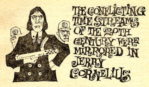 |
Left: Harry
Douthwaite's illustration of Michael Moorcock's Jerry Cornelius, from
New Worlds no.157, December 1965
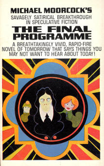
Below: The edition of The Final Programme (the first Jerry Cornelius novel) with Harry's cover was the US paperback by Avon, 1968—the true first edition, though with censored text |
||||
|
Dave told me about his plans to launch Savoy Books with financial backing from New English Library, and asked me if I'd like to paint book covers for him. At that time I'd given up on art and was working as a clerk in the finance branch at Royal Mail HQ. I felt as though I was spiritually bleeding to death there, so Dave's offer, and the strange way our paths had crossed, smacked of a God-sent opportunity and I jumped at it. The books Savoy planned to publish were those that Dave and Mike Moorcock were fond of and felt should see the light of day again (or for the first time in some cases). A line of Jack Trevor Story novels would be a priority. Why did Dave want me to contribute? Well, apparently he'd always admired a cover I'd done in the '60s, at Mike Moorcock's request, for his novel 'The Final Programme.' Dave had loved the bright colours, which he thought were "the sort of colours you get thrown out of art school for using." |
 |
||||
|
|||||
|
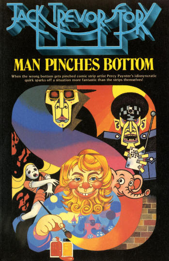
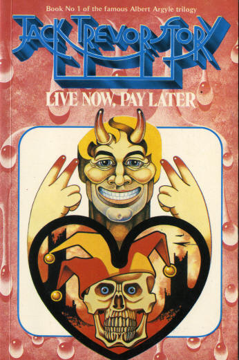
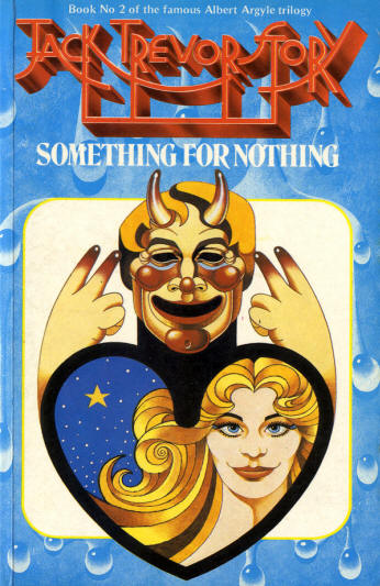
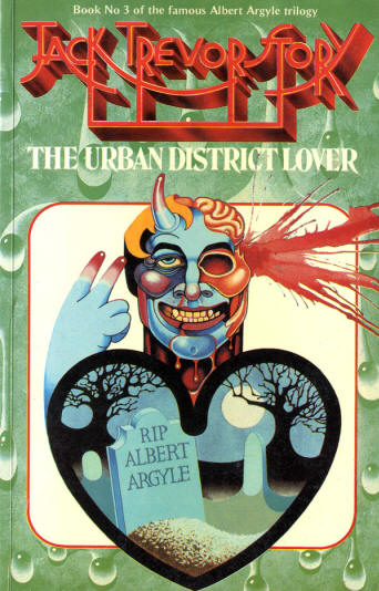
The way I approached the 'Albert' covers was determined basically by the fact that they were a series of interlinked books, but I can't remember exactly why I decided to treat them as a series of portraits. My aim, I must confess, was to paint pictures that would please Dave Britton, my number one fan, rather than accurately reflect the content of Jack's books. The text was just a jumping-off point for the paintings. This might dismay Jack's fans, but I was enjoying myself. |
|||||
|
|||||
|
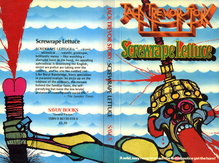
From my point of view, the cover for 'Screwrape Lettuce' marked a low point in the series. I painted it some time after the Alberts, and after I'd done some other stuff for Dave. I was feeling frustrated at that time by his fondness for darker themes than I was comfortable with, and when I was given this book to do I thought "Right. If you want outrageous I'll give you outrageous." I was a bit surprised by his reaction to it. I thought he'd be unable to publish it, but he loved it and saw no problem. I distinctly remember writer Mike Harrison (M. John Harrison) walking into the office that morning as we were looking at this painting. It was the first thing he saw as he came in and he just burst out laughing. "You can't publish that!" he spluttered. "You'll get sent down!" |
|||||
 |
|||||
|
Anyway, Dave did (publish it - and later, for other reasons, he got sent down too), and I used to see copies of the book popping up in respectable second-hand and remainder bookshops for years afterwards. Other Jack Trevor Story books were in the pipeline - 'I Sit in Hanger Lane' was one - but Savoy's luck ran out before they could be published, and the firm went bust in early 1980, abruptly ending one of the most interesting periods of my life. I have none of the original artwork except for the 'Man Pinches Bottom' cover. I got rid of all the preliminary sketches, etc. in subsequent years, when I decided to turn my back on the art world for good because it had generally brought me more pain than pleasure. I've no real idea what people thought, or think now, about my Savoy work. Jack commented favourably on 'Man Pinches Bottom', but I never heard what he thought of any of the others. Probably he hated them. Mike Moorcock has never commented either, to my knowledge, though I believe he still likes the painting that started it all - 'The Final Programme.' And a very small number of people were kind enough to say they liked the stuff when I put a message on Moorcock's website last year. C'est la vie. © Harry Warren (Douthwaite) 2006 |
|||||
| With thanks to Mark Young and the
Moorcock's Miscellany web site
|
|||||
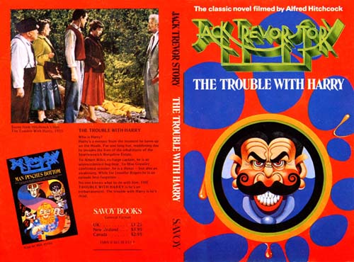 |
Another JTS book in the pipeline from Savoy at that time was The Trouble With Harry. Savoy kindly sent the artwork for this some time back. | ||||